Last week was our 1 year anniversary, meaning this week is the 1 year mark since our epic GoDaddy road show. This time last year, we personally folded and packed thousands of .xyz shirts and drove across to Arizona in our trusty RV. Do you remember this scene?

One thing that we didn’t have back then, were the hundreds of thousands of live .xyz websites we could’ve browsed through while we were on the road. It was especially rare to find .xyz sites that had an equally amazing mobile version of their website.
Have you ever noticed how a website looks different on your laptop compared to your tablet or cell phone? Your phone isn’t just automatically shrinking the original website, but actually, savvy web developers and designers magically code it so you can experience the same site in its best form – no matter what device you’re accessing it from. This is what they call “responsive web design” in the industry.
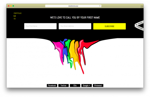
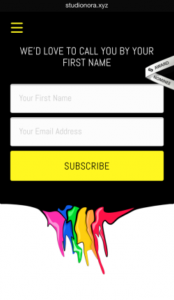
It’s pretty awesome to compare the different versions. Check out these .xyz websites and see how the full desktop browser version compares to its mobile counterpart.


It’s all about the details. Check out StudioNora.xyz and the attention they put into adjusting the newsletter form from your desktop browser to your phone.


Pretty cool, huh? With so many internet users on the go, it’s important to keep in mind how your website looks for the wide range of devices we use now-a-days. Do you have any web design advice you’d like to share? Drop us a line @XYZ on Twitter, Facebook, or Instagram.
Until next time, #GenXYZ. Ciao!
XYZ is proud to share about the many incredible members that make up the XYZ community! We encourage you to do your own research before using the products and services of the websites we feature. The information about products and services contained in this blog post does not constitute endorsement or recommendation by XYZ.