A personal website is your place online to share all the things you’re most proud of or passionate about. It’s your own piece of the internet, introducing your work, achievements, experiences, and anything else you want to share to a global audience. But, the portfolio-like nature of a personal website doesn’t require you to follow a cookie-cutter design to fit the status quo. Your website can show your own individuality so that you make a memorable impression on your visitors. In this week’s #WebsiteWednesday, you’ll meet two .xyz adopters whose personal websites are a great inspiration for how to let your personality shine through on your own personal website.
If someone asked you to think of one of your favorite public figures, chances are you would likely be able to picture their voice or way of speaking. It may be a famous author known for their poignant prose or a comedian treasured for hilarious one-liners. Either way, the language they use and how they use it helps them stand out as unique.
Your personal voice and way of speaking is an important part of your personal brand. That’s why using it to write the content on your website is a strong way to let your personality show through. For some inspiration on how to nail using your personal voice to write engaging website content, check out JamieLoftus.xyz.
JamieLoftus.xyz – eNom / Open SRS customer (United States)

Jamie Loftus is a Los Angeles-based comedian, writer, and animator. Her talents have earned her features in Vulture, The Boston Globe, and Forbes. She’s written for The New Yorker, Paste Magazine, Vice, and popular animated sketch show Robot Chicken. Jamie’s sharp, satirical wit is one of her greatest strengths. She uses this strength to write unique content on her website.
Starting from her home page biography, Jamie writes using various quips while sharing her skills and experience. This helps show visitors other talents while also introducing them to her style of comedy. Jamie uses dedicated pages to promote her podcast, past sketches, cartoons she’s animated, and her stand up comedy. Each of these pages includes a short description of her work, written in her own signature comedic style. Website visitors may even feel like they’re being treated to a mini comedy show just by navigating around Jamie’s website.
Try writing your website copy in your own unique voice to introduce your personality to visitors. This helps make your website’s content more impactful.
Your interests are intimately tied to your own personal brand. That’s why sharing them through the animated graphics and images on your website can be a great way to introduce yourself to potential collaborators, clients, or fans. To see a good example of this design strategy, check out the portfolio website SplendifeRachie.xyz.
SplendifeRachie.xyz – Freenom customer (United States)

SplendifeRachie.xyz is the online portfolio of singer, student, and YouTuber Rachie. A superfan of anime and Japanese culture, Rachie made her name by sharing vocal covers of Japanese songs to her more than 300,000 YouTube subscribers.
To show how much her interest in the culture means to her, Rachie has centered her website theme around anime characters and illustrations. Both her homepage and About page feature large illustrations of her as an anime character. The primary visual content on her website consists of thumbnails for her videos, which are almost always of anime characters as well. These colorful illustrations help her website viewers enter the world of anime and Japanese culture, where Rachie’s passions lie.
Include your biggest passions into your website imagery to help your visitors engage with and share in them just as you do.
Showing personality in your personal website allows you to connect with your desired audience and share what you love about your work or interests with the world. Your personal website is where you can share your passions. Since it is your own place online, it’s only fitting that it sounds, looks, feels, and says exactly what you want in your own personal style. Follow the example of these two .xyz adopters and infuse your personality into your personal website.
Tribe.xyz – Namecheap customer (Czech Republic)
The design of your website plays a critical role in winning customers for your business online. To maximize your success in driving leads, there are a few key elements your website should include. This week’s #WebsiteWednesday features a lead generation website that is a great example of how to use these elements effectively: Tribe.xyz .

Tribe.xyz is a recruiting consultancy offering candidate sourcing, screening, and hiring coordination. Their business relies on driving leads from companies looking for talent recruiting in Europe. To attract leads, they’ve added website design cornerstones like an explanation of their services and a pitch of what sets them apart. They also include strategic elements that guide website visitors toward reaching out to try their service.
Here are 5 elements Tribe.xyz includes on their website that you can follow to help improve lead generation from your business website.
A potential customer needs to know what your service is before they can decide if it’s right for them. Come up with a quick pitch that explains your product or service in easy-to-understand terms. This will help you cast the widest possible net and avoid turning away potential leads with difficult language.
Tribe.xyz explains step by step how their service works, starting right beneath the main image of their homepage. This puts the most crucial information a potential customer will want to know front and center on their website. They use icons corresponding to each step in their process, as well. This is a smart way to reinforce value props using visuals.
Make it simple for potential leads to learn about what your business does by using visuals and step by step, simple language.
The main goal of your website is to drive leads. It’s crucial that you have your content flow toward well-placed calls-to-action (or CTAs) that guide visitors to reach out to you. These CTAs act as signposts for visitors, showing them the way to learn more about you and try your product or service.
Tribe.xyz includes one CTA under the main description on their homepage and another underneath the step by step explanation of their business. This strategic placement aims to have a visitor read about Tribe.xyz, understand the value they offer, and then show that visitor how to try Tribe.xyz‘s service.
Try giving potential leads an easy way to get in touch with you by strategically placing CTAs under content that pitches your services.
A lack of structure on your website can drive visitors away before they even reach out to you. If you design your website with distracting colors or long blocks of text, you are asking the visitor to put in a lot of effort to understand what you do. Lead generation website designs that emphasize only valuable information and focus on guiding visitors to specific actions tend to perform the best.
Tribe.xyz uses only four colors in the design of their website. They keep all text short and easy to read, as well. This helps them convey only the most important information quickly and effectively. It also saves their visitors time by reducing reading and avoiding navigating a confusing website layout.
Use this simple design technique on your website to avoid cluttering your message and to clearly communicate value to potential leads.
Like the last tip, this one is about keeping the layout of your site simple for visitors. A clearly-labeled navigation menu is like a map your website visitors can carry with them as they interact with your website. It gives them an understanding of what information your site has to offer and helps instill trust through simplicity.
On Tribe.xyz‘s clearly labeled top navigation menu, the first tab acts as a CTA to “Hire Recruiter.” Their “Careers” tab signals to those seeking to work at Tribe.xyz. The “Log in” tab shows existing users where to log into the service. This straightforward layout helps Tribe.xyz direct visitors to specific destinations on their website, and avoids distracting from their message.
Add a simple navigation menu with clear labels to your site to make sure potential leads know where to go, and don’t get lost in content.
This may seem obvious, but it is also critical. Your potential leads need a way to get in touch with you, and a contact page gives a clear label of where to do that (along with your CTAs). Contact pages help increase user trust, and lend credibility by offering a direct line of communication for your visitors. Your contact page should include a phone number if applicable, and an email or contact form.
The link for Tribe.xyz ‘s contact page is in the footer at the bottom of their website. The page itself lists their physical address as well as an email to reach out to them. With this page, Tribe.xyz shows their company’s home base and provides a simple method to get in touch. This information helps potential users get a picture of Tribe.xyz ‘s company beyond their lead generation website.
Make sure to include a contact page on your website to increase consumer trust and avoid losing out on potential leads who cannot contact you.
The quality of your lead generation website’s design determines its effectiveness. The more clear, simple, and navigable it is – the better it will be at driving leads. Keep your lead generation site simple by using an uncluttered design. Clearly label pages via your menu so your visitors don’t get lost and leave your site. Create a contact page and use clear CTAs to earn site visitors’ trust and turn them into leads.
Tribe.xyz is a great benchmark to follow for these tips, and also serves as an example of how .xyz adopters are leading their industries with aspirational website designs. Check them out at Tribe.xyz to get inspiration when building your lead generation site.
AleydaRocha.xyz – GoDaddy customer (Austria)
Your own personal website gives you an ideal platform to share your accomplishments and interests with the world. If you have a lot of information you want to share, it can be challenging to publish it all in an interesting and engaging way. This week’s #WebsiteWednesday, AleydaRocha.xyz, offers a great example of how to do just that. She uses eye-catching video on her website to make her work as a researcher and artist as enthralling to her visitors as it is to her.

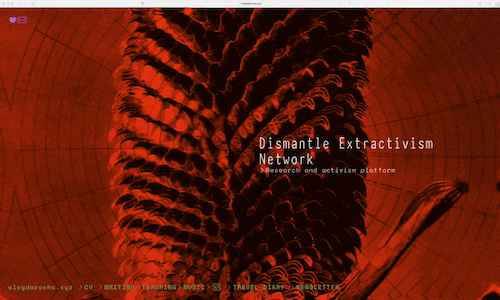
Aleyda Rocha is a researcher and artist, based in Vienna by way of Mexico. Aleyda completes most of her work in her role as a Scientific Researcher at the Austrian Academy of Sciences. Her research examines practices of extractivism and colonialism. More specifically, she’s focused on sustainability and fighting for social justice. Aleyda completes this work in her role as founder of the Dismantle Extractivism Network, which aims to visualize and fight extractive environmental practices. She’s also a founding member of Revoltosas Mexico, a non-profit organization dedicated to pushing forward gender equality in Mexico. Because Aleyda’s work deals with large social issues and complex global crises, it can be difficult to grasp and jump into right away. To make it engaging to non-researchers, Aleyda uses her artistic abilities to create unique videos for the projects she features on her website.
The dedicated page for Aleyda’s Dismantle Extractivism Network is a perfect example of her design strategy. She uses a visual intended to help the viewer understand her work on different levels. The warping image, though not fully clear, appears to be of a tree or other common symbol of nature. By having the image become distorted, Aleyda aims to create visions of extractivism in the viewer’s mind. Using this video, Aleyda creatively conveys the impact of the organization’s work by visualizing it in an emotionally resonant way. Aleyda uses the project page itself to explain the organization’s goals and research in more detail.
For her academic research project “Narratives of the desert,” Aleyda features a video of a cactus set against a bright blue desert sky. The cactus moves in and out of focus, almost as if it were a desert mirage. With this imagery, Aleyda gives the viewer the feeling that they are in the desert themselves. The video is strange yet inviting at the same time, enticing her visitors to click and read more about the project. The goal of the project is to highlight biocultural diversity, so it’s fitting Aleyda chose an image of a cactus that takes on many forms across the desert.

Aleyda has made some videos on her site interactive by allowing her website visitors to move their mouse over an image for an effect. One example of this is Aleyda’s page for her global program teaching inclusion, called the Peace Machines Workshop Series. She made an interactive video showing a fractal design of students from the workshop completing their projects. The design catches viewers’ eyes and also evokes a feeling that students are working to heal the fractures. To create more connection to the page, Aleyda made the image so that scrolling a mouse over it shifts the fractals’ movement toward the mouse. This is a great way to keep her website visitors engaged and even to entice them to click on the image to learn more about the program.

Aleyda uses a similar interactive video as the visual for her data exploration project “You Are The Dream Of Poles Awoken.” At first look, the video shows a tall, majestic mountain that is slightly obscured by horizontal lines. The lines cut through the mountain and make the image of the mountain move slowly up and down, towards its poles. Scrolling your mouse over the video lets you push the lines toward the top or the bottom of the image. This is a clever way Aleyda draws attention to poles on opposite sides of the image. It also sets up the project itself, which focuses on one pole in a small, snowy village in Norway and another pole in the Atacama Desert.

Making your website’s visuals engaging and interactive helps bring your work and your website to life. If a single picture is worth a thousand words, then Aleyda has made her site an example of how to speak millions of words and evoke emotion without using much text at all. Her website’s visuals inspire visitors to interact with them, and helps improve the likelihood they will click and read more about her work. If your visitors can feel they are a part of what you do, there is a better chance they will take it in and remember it. Follow Aleyda’s lead and try exploring videos and visuals to showcase projects on your website. Get more from Aleyda herself by signing up for her newsletter, following her on Instagram, or jumping into her portfolio on AleydaRocha.xyz.
In this XYZ Quarterly we’ll cover five important features to add to your app’s promotional website and recap XYZ’s Q4 2020 activity.
Read on for Part 1: “How to build the ultimate website for promoting your app or project”
Or jump down to Part 2: “XYZ’s Q4 2020 Recap.”
Making a strong promotional website for your app or project is critical to its success. Showcasing your app on your website, a platform that you control, can help you reach potential users worldwide. A website enables you to promote and present your app independently, giving you creative reign over your marketing and your audiences. Launch your website on a short and memorable domain, and it becomes easy to share through social media, email, and word of mouth.
We’ll show you five essential features to consider in order to get the most out of your app’s promotional website. In this edition of the XYZ Quarterly, we’ll explore five app websites that offer stellar examples of these features that you can use to market your own app or project.
A key step to marketing your app is to succinctly tell users exactly what it does. This important information should be quick to read and front and center on your website. Make it easy to understand the purpose of your app by using short sentences designed with high visibility. This strategy helps visitors decide immediately what they want to do next. By providing simple information from the start, you can lead website visitors down the path to the next steps you want them to take. To see how this tip works in practice, look to UseMy.xyz.
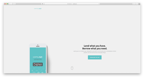
UseMy.xyz is an app where users can lend everyday items to others or find and borrow an item they need. Their homepage features a two-sentence elevator pitch of the benefits to users, along with a quick description of what the app does. UseMy.xyz includes a prominent button with a call to action (CTA) to download the app, located immediately under this description. Their strategy is to tell users what their app does via the elevator pitch, then make it easy to get to the app with a simple click. In less than 30 seconds, UseMy.xyz gives future users what they need to know to get started.
Try this strategy on your homepage to quickly relay information that new users need about your app, and encourage app downloads.

Crafting a promotional website for your app can help generate downloads and add new users. It’s essential that you make download links clear and highlight them so that they are one of the most important elements on the page. A call to action (or CTA) is an element of your website that tells your audience what to do. Websites most often will utilize a highly visible button with action text, that makes it easy for the user to see and click right off the bat. An example of a solid CTA layout can be found on POAP.xyz’s website.
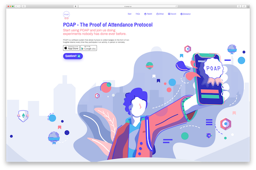
POAP.xyz is an app that uses decentralized technology to create a system where users can collect badges to confirm their participation in activities at events. POAP.xyz’s homepage is colorful and simple, and right in the center of the screen they feature a small group of calls to action. POAP.xyz uses the brands of Apple App Store and Google Play in their CTA buttons to show users where the app is available. A third button calls out “Questions?” which leads users directly into messaging with their team.
Try placing prominent marketplace-specific buttons on your website to immediately signal where potential users can get your app and help increase download conversions.
Your elevator pitch and images of compatible devices help viewers create a solid understanding of your app. To showcase the full range of benefits of your app, you can present a magnified version of each feature on your website. Use short, easy-to-read sentences that explain important individual features and their benefits. Share close-up images of these features next to the descriptions so users will know how to use your app as soon as they open it. A great example of this strategy is Mee6.xyz‘s website.
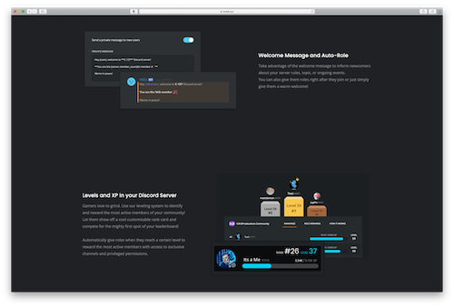
Mee6.xyz is a bot made to integrate into the messaging platform Discord, and gives users more control over their community. Mee6.xyz allows users to add custom commands and roles for members, or gain ranking based on activity related to the community. These services can be difficult to picture, so Mee6.xyz features screenshots of each one as they would look in use on a Discord server. These visuals help explain, showing potential users how the features work, and also make it easy to visualize the benefits.
Help users grasp the benefits and get them thinking about the ways your app can solve their problems by illustrating your app’s features.

There are an overwhelming amount of apps available today. Generating trust in your app is important if you want folks to try it out. One of the strongest ways to earn that trust is by showing your app has “social proof” of its legitimacy and benefits. While app platforms already provide reviews, you can use your website to highlight the best reviews from your users, and also feature testimonials posted on other mediums. These could be social media posts, quotes, or even videos of users talking about why they like your app. GitHistory.xyz can help provide some inspiration for trying this tip.
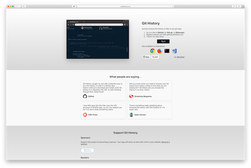
GitHistory.xyz is a browser application that enhances a key feature of Github, a popular platform amongst the developer community for code collaboration and version control. GitHistory.xyz’s website proves the app’s popularity and legitimacy by listing testimonials from well-known members of their target audience in a section on their website titled “What people are saying…” This adds social proof and shows the app is popular with makers and developers, which are GitHistory.xyz’s ideal user base.
Try this tip on your website to increase trust with new users and help increase downloads of your app from your target audience.
New users often want to see your app in action before they try it themselves. Seeing how it works helps them feel more comfortable by trying before buying (or downloading.) Get inspiration for your website by seeing an example of how this is done, and also preview a useful tool that will help you do it yourself on Overframe.xyz.
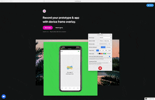
Overframe.xyz is a recording service that helps users make demo videos of their app in use. Overframe.xyz knows the value of adding app demo videos to your website, because their app is a tool that creates demo videos! On their own website homepage, they feature a gif of the Overframe.xyz tool in use, showing the user interface of the app. They include a secondary call to action right next to their “Get it now” button, and an option to watch a demo. Clicking on the “Watch demo” button pops up a video that shows how a user can use their app to record their own app demo. This video helps potential users get a quick idea of the quality and ease of use of Overframe.xyz’s tool.
Try giving your audience a look at your app in action so they can know what to expect from the user experience. They’ll be able to see the benefits your app offers firsthand, and go into using it with more trust.
When it comes to making the ultimate website to promote your app, focus on making information easy to find and process. Give your visitors a quick pitch of your app, use clear download CTAs, and give social proof that others like your app to help turn website visitors into app users. Visualize the features and benefits of your app, offer videos or demos, and share the devices it works on to start users off on the right foot. Provide potential use cases to help your site visitors get a clear picture of how they will use your app, as well.
Following the example of the five .xyz websites above can help you make your app’s promotional website as effective as possible for generating users.
2020 has finally drawn to a close. For XYZ, Q4 was filled with just as much activity, innovation, and excitement as always. Here’s how the XYZ team, our partners, and allied organizations helped make the most of the end of 2020.
On December 1, XYZ introduced the first-ever domain names made for the beauty industry: .Beauty, .Hair, .Skin, and .Makeup. The naming opportunities of these new domain endings give brands, professionals, influencers, and communities of the multi-billion dollar beauty industry an exciting new way to build a flawless, industry-specific online presence.
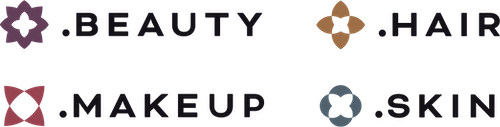
.Beauty, .Hair, .Skin, and .Makeup allow beauty brands, professionals, and influencers to get affordable, memorable URLs that match their brand name, first and last name, social handle, or creative idea. The domains will carry an expected MSRP of $15-$20 and are going through an early access period for trademark holders called the Sunrise period now until February 5, 2021. An unrestricted early access period will be held for anyone willing to pay an extra fee to get their domains before everyone else from February 10 until March 2. On March 2, 2021, the domains will become available to beauty pros, brands, influencers, fans, and everyone else worldwide.
![]()
December 1st also saw the arrival of .Quest, the domain made for gurus, experts, and authorities in any field. .Quest is the perfect domain for internet users to prove their website as the destination their audience is seeking.
.Quest follows the same launch phases as .Beauty, .Hair, .Skin and .Makeup, with a Trademark Holder Landrush period taking place now until February 5th. The domain will embark on its journey to serve online authorities everywhere on March 2, 2021.
The virtual hackathon scene is continuing to flourish, and XYZ helped support attendees at seven hackathon events in both India and the U.S. in Q4 of 2020.
Thanks to XYZ’s ongoing relationships with Script India Foundation and the Institute of Electrical and Electronics Engineers in India, XYZ supported five events in the region in Q4. Participants at IEEE Elysium, Let’s Hack, Hack the Bond, and Hack with CodeWarriors received .xyz domains to help them get their ideas and projects online. The hackathons focused on coming up with solutions to big problems like climate change and the Covid-19 pandemic. XYZ is proud to help participants share their ideas and solutions with a global audience via their new .xyz domains.
XYZ was also a returning sponsor of US-based events Cutie Hack and Hack RPI in Q4. Participants were happy to see XYZ return and welcomed another year of access to .xyz domains for their projects, portfolios, and ideas. They also appreciated XYZ’s guidance on how to set up their perfect .xyz website.
Higher education institutions have had a challenging year. To help them adapt to online learning, many XYZ partners shared how .College domains provide a platform for these schools to keep students and teachers connected. In addition to offering a sale on .College domains, GoDaddy, Dynadot, Rebel, and Porkbun each shared blog posts on how .College domains can take higher education organizations to the top of their class online.
Porkbun, Pananames, Rebel, and Domain Cost Club also shared a short video helping educators visualize the benefits .College could have for their institution. We’re proud to have our partners’ support in spreading the word about .College during this critical time for learning institutions online.
Creatives, out-of-the-box thinkers, and those seeking a unique domain for their website got a spooky surprise this Halloween thanks to cdmon and Pananames. Both partners served up spooky good deals on .Monster domains, with sales of up to 92% off standard price.
As Halloween is fast approaching hurry up to get your .monster domain name with a huge 92% discount https://t.co/6sKWdyysD7 #monster #Halloween2020 pic.twitter.com/wi775a9XzZ
— PanaNames (@PanaNames) October 26, 2020
Celebra un #Halloween de miedo con la #promoción más monstruosaaaaa 😈
🎉 Consigue ahora el #dominio .monster por solo 0,95€ 👻
👉 https://t.co/4mm3i5ogeE pic.twitter.com/DTxe8dEJxU— cdmon (@cdmon) October 29, 2020
The sale was the perfect opportunity for ghouls and ghosts everywhere to grab deals on domain names that are sure to help their websites make a beastly impression.
The XYZ Anti-Abuse Team is at the forefront of safeguarding the namespaces of all XYZ extensions. In Q4 2020, they welcomed five new partners to join in their efforts to keep these zones safe and reputable. Thanks to the Anti-Abuse Team and our partnerships in the cybersecurity industry, .xyz concluded Q4 with a lower average badness score than other legacy TLDs during the quarter, according to Spamhaus.1
Adopters of XYZ’s family of domains can count on the XYZ Anti-Abuse Team and its partners to aggressively halt abusive use of any XYZ domains in accordance with XYZ’s Anti-Abuse policy. To report abuse of a .xyz domain, submit evidence at gen.xyz/abuse.
Online shopping was the go-to gift buying method this holiday season. XYZ helped online shoppers get the world’s favorite new domain, .xyz, for as low as $0.50 on Black Friday and Cyber Monday. XYZ’s partners Alibaba, Tencent, WestCN and Xinnet rang in the start of 2021 with holiday sales on .xyz domains. Their customers can start the new year with a memorable .xyz name and set themselves up for a productive year all for customer-friendly prices under $1.
2021 is finally here, and XYZ has big plans for the upcoming year ahead. Stay tuned by subscribing to our newsletter, following us on Instagram, Twitter, and Facebook.
Sources:
1. https://www.spamhaus.org/statistics/tlds/
Wave.xyz – GoDaddy customer (United States)
Creative companies are often guided by their unique identity or mission, and use that to stand out to potential clients. AandB.xyz uses their “born digital” identity to help clients create successful online campaigns. Byld.xyz trusts their process and uses it to help established brands innovate solutions by creating new startups. AtelierInteriors.xyz follows the creative guidance and unique design vision of their founder, Adri van Zyl. This week’s #WebsiteWednesday features another .xyz adopter fueled by their own unique philosophy to make a positive impact through their work: Wave.xyz.

Wave.xyz is a “cause first creative collective” specializing in promotional initiatives that make a positive impact. Wave.xyz’s name is a reference to their company philosophy. Featured on their About page, Wave.xyz’s philosophy uses a memorable metaphor that fits perfectly as the company’s elevator pitch.
“Life is made of waves. Both modest or massive, waves make impact, washing upon shore for a fleeting impression.
Through constant connection with sand, waves have the unique ability to shift boundaries.
A wave is also a moment in time for brands.
Applying such logic to brands is critical for making meaningful waves that break through disorder, generate change, and accelerate impact.” – Wave.xyz
To help brands achieve influence, Wave.xyz offers services spanning the full promotional process. This includes developing a complete strategy, creating materials, and managing the rollout of a campaign as well. One way they aim to set themselves apart from other creative agencies is by choosing to be “nomadic.” This means Wave.xyz goes to their client and works from the front line. Their goal is to immerse their team in the environment and create the most meaningful final product.
Wave.xyz have brought their impact-focused solution to a few notable brands. In 2018, they created a film for NOVA Hope for Haiti to help the organization raise funding at their annual casino night event. The overall project goal was to recount 16 years of NOVA Hope for Haiti’s work in the region. To accomplish this, Wave.xyz filmed on location in South Haiti and spoke with residents to show the challenges the region is facing. Then, they created promotional collateral and managed a full campaign on social media to raise awareness of the film. The full campaign shows how NOVA has helped bring the region much-needed medical care and the positive effect it’s had. NOVA has continued to use Wave.xyz‘s film as an introduction to their work on their company website, showing the lasting value that Wave.xyz‘s work had for them.
For the Church of St. Francis of Assisi’s LGBT+ Ministry in NYC, Wave.xyz completed a full branding overhaul. They developed a new branded color palette and communication strategy that reflects the ministry’s values. They then adapted this new strategy to the ministry’s print, email, digital and social media presences. Wave.xyz says the ministry loved the new branding, which was also well-received by many parishioners at their church.
In one of their larger projects, Wave.xyz worked with the Alzheimer’s Association in San Antonio and South Texas to create a national fundraising campaign. This campaign was set to kick off the organization’s biggest fundraising event of the 2018-19 fiscal year – the #ENDALZ campaign. Wave.xyz filmed a video featuring individuals who have a loved one with Alzheimer’s to inspire change by showing how many lives Alzheimer’s affects. Wave.xyz say their work helped to “invigorate advocates” ahead of two major fundraising events for the association that year.
Wave.xyz chose the perfect brand name to fit their mission, and their globally recognized .xyz domain is ready to grow alongside them as they continue to make waves in their industry worldwide. Wave.xyz makes it easy for those interested in working with them to begin the process via their website or branded social media. They have secured @wave.xyz on Instagram and Facebook and @wavedotxyz on Twitter and LinkedIn. These handles make them easy to find and promote their website URL right in their social media handle. Their CEO Jason Syptak has gotten creative with their memorable URL as well, listing himself as “🌊.xyz founder” on LinkedIn. Reach out to Wave.xyz via their website’s contact form, or stay up to date on their latest projects by subscribing to their newsletter.