“When conceptualizing Access.xyz, we wanted a domain that encapsulated our forward-thinking approach and our commitment to connecting communities of all types. The .xyz domain, with its universal appeal, perfectly symbolized our mission to provide comprehensive, community engagement solutions. It resonated with our belief in limitless possibilities, transcending traditional boundaries, and connecting with the next generation of digital natives.”
– Kevin Brown, CEO, Access.xyz
Discover a curated selection of available .xyz domains with our .xyz premiums, .xyz numbers, and CNOX search tools.
* Premium XYZ Registry domains refer to premium domains for extensions with standard and premium domains, and XYZ’s premium namespaces such as .Cars, .Car, .Auto, .Theatre, .Storage, .Security, and .Protection.
** “BIN” (or High/Low) priced premium domain. Domains in this tier have a premium price for the first year, but renew at standard pricing. All other premium domains have annual premium renewal fees.
(not ranked)
| 99.xyz | Exotic.Cars |
| Computer.xyz | A.CEO |
| Lawn.xyz | Motion.Game |
| Unit.xyz | USA.Homes |
| Art.Audio | Gaming.Monster** |
| FX.Auto | NO.Pics |
| Bots.Auto | Move.Quest** |
| Joy.Baby** | Big.Rent |
| True.Beauty | Kai.Security |
| Solo.Car | Wallet.Storage |
| 402.xyz | Vice.Game |
| RTD.xyz** | Deal.Quest** |
| Peter.xyz | Discount.Homes** |
| Ryde.Auto | Agent.Monster** |
| DP.Audio | BA.Security |
| DS.Beauty | Simple.Security |
| Revshare.Cars | Bay.Storage |
| Dick.CEO | Hello.Storage |
| Super.Game | Edge.Theatre |
| PH.Game | Loves.Theatre |
(source: Namebio.com)
| Total dollar value: $36,957.00 |
| Average price: $754.23 |
| Low Price: $101.00 |
| High Price: $3,650.00 |
| Maximum SLD characters: 25 |
| 3L – 6 (12.25%) 4L – 7 (14.29%) |
(Ranked by volume)
(Price listed is MSRP)
(source: Namebio.com)
(source: Internal Data)
*** Starting March 2023, the top 10 Trending .xyz SLD Keywords are expanded to include 2-character keywords.
Starting July 2023, we have expanded from Top 10 to Top 20 Trending .xyz SLD Keywords, and added the 2-character keyword “my” in our dataset. Though we consider “my” to be a keyword modifier, this addition is intended to align with industry focal points.
1. https://techreport.com/crypto-news/infinex-raises-65m-new-patronage-model/
2. https://www.coindesk.com/tech/2024/08/15/chaos-labs-raises-55m-as-demand-grows-for-on-chain-risk-management/
3. https://www.coindesk.com/business/2024/08/30/bridge-fundraising-for-stablecoin-based-payments-network-totals-58m-report/
4. https://www.businessinsider.com/scoop-slingshot-ai-raises-30-million-a16z-menlo-follow-2024-8
5. https://www.businesswire.com/news/home/20240926127309/en/Bot-Auto-Secures-20M-in-Pre-A-Funding-to-Commercially-Deploy-Autonomous-Trucking
6. https://www.morningstar.com/news/business-wire/20240917913695/hemi-labs-raises-15-million-to-launch-advanced-modular-blockchain-network-powered-by-bitcoin-and-ethereum
7. https://www.theblock.co/post/318102/initia-funding-token-valuation
8. https://www.coindesk.com/press-release/2024/09/26/mind-network-secures-10-million-in-pre-a-round-funding-to-continually-build-fhe-fully-homomorphic-encryption-layer/
9. https://www.theblock.co/post/312646/bitcoin-restaking-platform-satlayer-funding
10. https://www.theblock.co/post/312222/paradigm-sorella-labs-ethereum-mev-problem
11. https://www.cmointern.com/2024/09/daylight-raises-6m-to-power.html?m=1
12. https://www.calcalistech.com/ctechnews/article/rkg711c3ha
13. https://www.theblock.co/post/316695/a16z-csx-fund-and-lemniscap-lead-5-2-million-seed-round-for-fermah
14. https://markets.businessinsider.com/news/currencies/cudis-secures-5m-seed-led-by-draper-associates-to-challenge-oura-ring-in-the-wearables-market-with-blockchain-and-ai-1033780899
15. https://www.crunchbase.com/funding_round/rise-labs-seed–7b094ec4
16. https://x.com/0xAstra_xyz/status/1836039358954328341?lang=en
17. https://www.finsmes.com/2024/09/ammalgam-raises-2-5m-in-funding.html
Hyperbolic.xyz – Squarespace customer – (United States)
Innovators exploring the power of artificial intelligence are adopting .xyz domains to share their developments. Web3 platform Datalayer.xyz aims to revolutionize blockchain and AI with user-owned innovations. Tech company Oh.xyz aims to build decentralized and uncensored AI infrastructure for digital creators. Digital platform CaptureApp.xyz harnesses AI and blockchain technology for asset management. AI-powered DawnWallet.xyz is aimed at seamless Ethereum interactions. In this week’s #AIMonday, we’ll introduce you to an AI platform that aims to democratize access to powerful computing resources: Hyperbolic.xyz.

Hyperbolic.xyz is the online home of Hyperbolic Labs, an AI infrastructure startup focused on providing open-access computing resources for AI developers. The San Francisco, CA-based company aims to meet the growing need for affordable access to powerful computing resources called GPUs (graphics processing units). These GPUs are essential for developing AI tools but are usually expensive to rent from major cloud providers. Hyperbolic offers a more affordable solution by gathering unused GPU power from personal computers and data centers around the world. In July 2024, Hyperbolic Labs raised $7 million in seed funding, with Polychain Capital and Lightspeed Faction leading the round, alongside investors like Chapter One, LongHash, and Bankless Ventures.1
Hyperbolic Labs’ platform is designed to work through a network of connected computers that share unused GPU power globally. This network is supported by blockchain technology, which helps keep it secure and reliable. The platform also uses a special system called Hyper-dOS to ensure AI projects run smoothly on different types of GPUs. Hyperbolic provides access to well-known AI tools, such as Meta’s Llama and Stable Diffusion, making it easier for people to work on AI projects without needing expensive resources.
Hyperbolic Labs is working on launching a proof-of-sampling consensus protocol on its own blockchain, which will support its decentralized network and allow users to contribute and monetize unused GPU resources. This step will further their mission to make AI development more accessible and affordable.
Jasper Zhang, co-founder and CEO of Hyperbolic Labs, has a background in mathematics and blockchain research. With a Ph.D. in Mathematics from UC Berkeley, Jasper has a history of academic achievements, including gold medals in prestigious mathematics competitions. His vision for Hyperbolic Labs is to create a future where AI resources are available to all, not just large organizations, by building an open-access AI cloud that democratizes access to computing power.2
The choice of Hyperbolic.xyz for Hyperbolic Labs’ website reflects their commitment to innovation and open access. The .xyz domain is known for its alignment with forward-thinking companies in emerging technologies like AI, AR, and blockchain. By using this domain, Hyperbolic Labs signals its dedication to creating a decentralized and accessible AI platform for developers, researchers, and organizations globally. .XYZ complements their mission of openness and collaboration, supporting their vision for the future of AI development. You can learn more about the company by following them on X/Twitter, LinkedIn, and YouTube, by joining the Discord, and by visiting Hyperbolic.xyz.
1.https://siliconangle.com/2024/07/30/hyperbolic-labs-raises-7m-blockchain-based-ai-network-utilizes-worlds-idle-gpu-capacity/ 2.https://medium.com/hyperbolic-labs/meet-hyperbolic-ceo-jasper-zhang-on-a-mission-to-make-open-access-to-ai-a-reality-for-everyone-f1a2ec98bb96Frequency.xyz – GoDaddy customer – (United States)
Innovative blockchain engineers are using .xyz domains to showcase cutting-edge projects. Bitcoin project Citrea.xyz harnesses zero-knowledge technology to expand crypto capabilities. Web3 platform Bonfire.xyz seeks to revolutionize creator engagement and digital ownership. Blockchain platform Conduit.xyz seeks to simplify rollup deployment with streamlined solutions. In this week’s #BlockchainThursday, we’ll introduce you to a blockchain platform designed to power decentralized social networks: Frequency.xyz

Frequency.xyz is the online home of Frequency, an innovative blockchain designed to support decentralized social media networks. It provides the infrastructure needed for apps that help users control their own data while interacting in the digital world. Frequency’s system aims to help manage online relationships, store personal information, and handle messaging at a global scale. It also includes tools aimed at helping developers create user-friendly apps where people maintain privacy and control over their online activities. The network runs on its own cryptocurrency, FRQCY, which powers its operations. On August 21, 2024, the platform reported over 1 million users through its partnership with social media app MeWe.1
Frequency offers several key features to help make decentralized social networks operate smoothly. One of its standout features is a system for discovering messages efficiently, geared towards ensuring that communication can happen quickly and at a global level. It also provides storage solutions for personal data, such as friend connections and identity details, helping users manage their online relationships. Additionally, Frequency introduces a cost-saving model that aims to make transactions more affordable for users, making it easier for everyone to participate.
Another important aspect of Frequency is its alternative approach to handling transactions. Instead of always relying on traditional payments, Frequency strives to help users stake tokens to gain access to ongoing services within the network. This means users could enjoy consistent access to the network without a requirement to pay each time they interact. This flexible approach is designed to make decentralized social apps feel familiar and easy to use, while still giving people full control over their personal data.
Choosing a .xyz domain for its online presence reflects Frequency’s commitment to innovation and forward-thinking technology. .XYZ is known for its versatility and alignment with next-generation digital projects, particularly in web3, blockchain, and decentralized platforms. By developing Frequency.xyz, the project signals its place in the evolving digital economy, where decentralized networks and user control are at the forefront of the social media landscape. You can learn more by following the platform on X/Twitter and by visiting Frequency.xyz.
1.https://www.prnewswire.com/news-releases/frequency-blockchain-celebrates-over-1-million-users-in-partnership-with-mewe-302227534.htmlOnniCreative.xyz – Network Solutions customer – (United States)
Creative agencies are using .xyz domains to build their online hubs and showcase their portfolios. Production studio FutureFrank.xyz creates media for global brands like Nike and Weight Watchers. Content studio SpaceOddity.xyz creates media campaigns for brands like Amazon and TikTok. Branding agency LetterA.xyz works with world-renowned brands like Casetify, Ann Taylor, and Kate Spade. In this week’s #WebsiteWednesday, we’ll introduce you to a creative agency driving innovation and inclusivity in entertainment: OnniCreative.xyz.
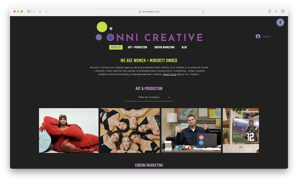
OnniCreative.xyz is the online home of Onni Creative, a Los Angeles, CA-based, women and minority-owned creative agency that serves entertainment clients. Founded in 2020, the agency focuses on set decoration, art and production design, and experiential design for a variety of entertainment projects. Additionally, Onni Creative offers specialized digital marketing services tailored to the needs of small, independent cinemas. The agency is also committed to sustainability, incorporating eco-friendly practices in their production processes whenever possible.
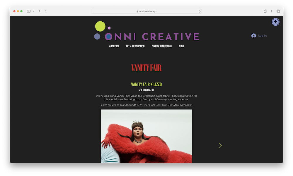
Onni Creative’s website provides detailed information about their services, including art and production design and cinema marketing. The website also features a blog that discusses topics related to entertainment productions, marketing, and creative projects that highlight underrepresented creators. The blog covers subjects such as cinema activations, film activations, digital marketing strategies, and production design techniques. OnniCreative.xyz also highlights Onni Creative’s past work, which includes projects like a special Vanity Fair feature with Lizzo and a collaboration with the cast of Euphoria for The Cut in New York Magazine. These examples showcase the agency’s involvement in both commercial and entertainment sectors, providing production design and art department services for film, TV, commercial, and photography shoots.
Geonni Sigl, the founder of Onni Creative, has a background in graphic design, art direction for film and television, and interior architectural design. She founded the agency in 2020 and oversees its daily operations and business development. Before starting Onni Creative, Geonni served as the director of marketing for United Artists Releasing, where she led theater marketing campaigns for films like House of Gucci, No Time To Die, and Licorice Pizza.
OnniCreative.xyz highlights the agency’s branded email address, [email protected]. This email address not only reinforces Onni Creative’s identity and professionalism but also enhances brand recognition and trust among recipients. The .xyz branding helps Onni Creative emphasize its commitment to innovation and inclusivity in the entertainment industry, creating a consistent and memorable point of contact. This approach ensures that communications are easily identifiable, promoting a sense of authenticity and reliability in Onni Creative’s interactions with clients and collaborators. Additionally, the contact form at the base of their website provides a direct and efficient way for potential clients, partners, and collaborators to reach out, further streamlining the communication process while maintaining a professional and approachable image. You can learn more by following the agency on TikTok, Instagram, Facebook, and LinkedIn, and by visiting OnniCreative.xyz.
OpenEXA.xyz – Squarespace customer – (United States)
Forward-thinking developers are using .xyz to showcase their AI-focused solutions. Tech company Catena.xyz champions privacy and open-source AI with innovative solutions. Tech company Tuple.xyz explores the intersection of cloud technology and AI for genomics research. Data platform Shape.xyz implements AI to make data analysis intuitive. In this week’s #AIMonday, we’ll introduce you to a hybrid repo platform that bridges traditional finance with cutting-edge AI and crypto technologies: OpenEXA.xyz
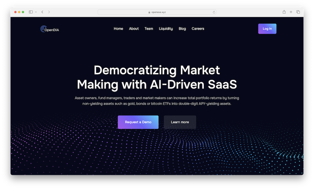
OpenEXA.xyz is the online home of OpenEXA, an AI-powered hybrid repo platform designed to help fund managers enhance their total portfolio returns by leveraging traditional assets within the crypto markets. A hybrid repo platform combines traditional repurchase agreements (repos) with newer financial technologies like blockchain and cryptocurrency. It allows asset owners, such as those holding bitcoins, gold, or bonds, to turn these non-yielding assets into high-yield investments. OpenEXA aims to maximize portfolio returns by merging traditional finance with the crypto market.
OpenEXA utilizes advanced AI technologies, including machine learning and large language models, to provide various features that cater to both lenders and traders. The platform’s AI engine, such as the Relative Value (Rel-Val) and Tearsheet models, identifies market opportunities and sets prime lending rates in real-time based on demand. This AI-driven approach is designed to help traders fine-tune their strategies and execute trades, either manually or through AI agents, while lenders benefit from optimized, demand-driven pricing.
OpenEXA’s platform is built with a focus on transparency and trust. The platform is designed to provide clarity in pricing and asset exchange, addressing the challenges fund managers face in navigating the complex regulatory environment of the Bitcoin market. Additionally, OpenEXA’s commitment to open-source standards and community-driven development ensures that their solutions are both innovative and accessible, leveraging on- and off-chain credit to unlock untapped alpha in financial markets.
Ajit K. Dubey is the Founder and CEO of OpenEXA Inc. He brings over a decade of experience from technology startups and leading financial institutions like Goldman Sachs, Bank of America, and American Express. Before founding OpenEXA, Ajit led Bond Intelligence Inc., an AI startup focused on using machine learning and big data to analyze risk and pricing in the fixed-income markets. Ajit is also actively involved in the academic and professional finance communities. He has served as a guest lecturer and industry collaborator for the University of Washington’s MS Degree in Computational Finance & Risk Management, particularly for the CFRM Class of 2019. Additionally, he has contributed to the industry through roles such as serving as a reviewer for IEEE on Intelligent Systems for AI in Fintech and representing Bond Intelligence Inc. on the XBRL Business Reporting Standards Committee.
OpenEXA’s choice of the .xyz domain aligns with its innovative and forward-thinking approach. .XYZ is synonymous with the next generation of the internet, making it a fitting choice for a platform that bridges traditional finance with cutting-edge AI and blockchain technologies. By using a .xyz domain, OpenEXA not only emphasizes its commitment to innovation but also positions itself within a community that values creativity, transparency, and the future of the web. You can learn more by following the platform on X/Twitter and LinkedIn, and by visiting OpenEXA.xyz.