Datalayer.xyz – Dynadot customer – (United States)
Developers exploring the power of artificial intelligence are adopting .xyz domains to share their innovations. Tech company Oh.xyz aims to build decentralized and uncensored AI infrastructure for digital creators. Digital platform CaptureApp.xyz harnesses AI and blockchain technology for asset management. AI-powered DawnWallet.xyz is aimed at seamless Ethereum interactions. In this week’s #AIMonday, we’ll introduce you to a blockchain platform that supports decentralized AI applications through its innovative multi-chain architecture and user-owned data approach: Datalayer.xyz.
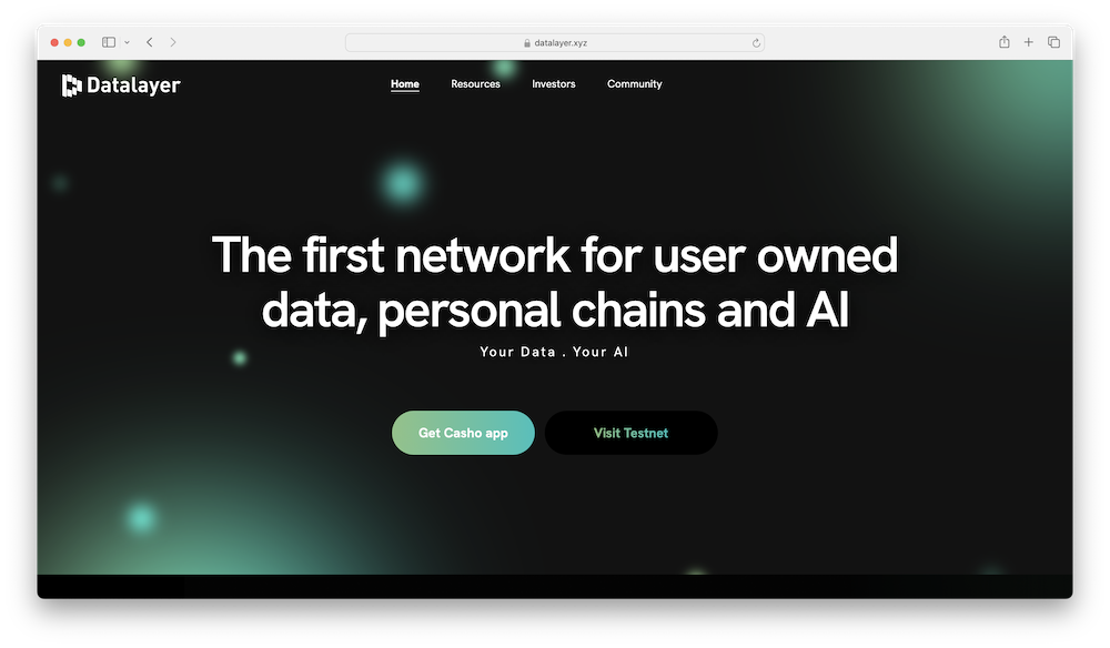
Datalayer.xyz is the online home of Datalayer, a blockchain platform designed to address scalability and security challenges. It utilizes a multi-chain system where users control their own local blockchains, providing each user with dedicated space for their data. This approach aims to resolve the issue of limited space on traditional blockchains. Datalayer’s architecture supports fast, efficient, and responsive blockchain operations, made for web3 applications. It employs a delegated proof of stake mechanism for decentralized governance and security, with community audits and economic incentives helping to maintain network reliability.
The platform emphasizes user-owned AI, using its architecture to support decentralized AI applications. The Data Portability Layer enables users to transfer their data from various sources to their personal chains and move it to other services without losing access. This is facilitated by LINK, a two-way API that ensures seamless data transfer and user control. The Data Exchange Layer integrates consumer data acquired via the app Casho into the network, facilitating data transactions and ensuring validation and accessibility for all ecosystem participants.
Additionally, Datalayer helps users train AI models using their private data, contributing to user-owned and governed predictive and foundation models while advocating individual privacy and ownership. This decentralized AI approach is designed to ensure that users maintain control over their data and the AI models derived from it, fostering a more personalized and secure AI ecosystem.
A domain name like Datalayer.xyz aligns perfectly with Datalayer’s mission of innovation and collaboration in the blockchain and AI spaces. .XYZ is widely recognized for its association with cutting-edge technology and forward-thinking communities, making it an ideal fit for a platform dedicated to addressing scalability and security challenges. Additionally, .xyz is known for its flexibility and global appeal, allowing Datalayer to reach a broad audience and convey a sense of modernity and relevance. This choice of domain underscores Datalayer’s commitment to providing accessible and advanced solutions for web3 applications and user-owned AI initiatives. You can learn more by following the platform on X/Twitter @datalayerxyz, joining the Discord, and by visiting Datalayer.xyz.
Dill.xyz – GoDaddy customer – (United States)
Innovative developers are using .xyz domains to showcase cutting-edge blockchain-focused projects. Web3 platform Bonfire.xyz seeks to revolutionize creator engagement and digital ownership. Tech company Nexus.xyz harnesses zero-knowledge cryptography to advance verifiable computation. Tech startup AnsibleLabs.xyz aims to simplify the conversion of cryptocurrency. In this week’s #BlockchainThursday, we’ll introduce you to a network geared towards enhancing data availability in the blockchain: Dill.xyz.
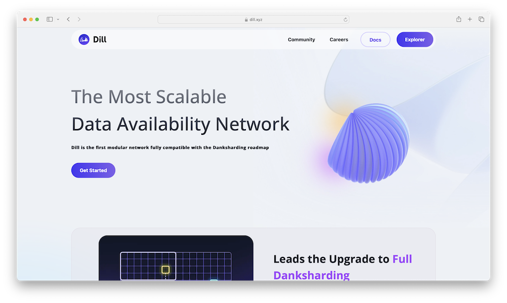
Dill.xyz is the online home of Dill, a data availability network that uses sharding technology to enhance blockchain performance. Sharding is a technique used to improve performance and scalability by dividing a network or database into smaller, more manageable pieces called shards. Each shard operates independently, handling a portion of the total workload, allowing the system to process more data simultaneously and efficiently. Unlike traditional monolithic blockchain structures, Dill separates different functions into specialized layers, improving efficiency and scalability. Key features include a sharding architecture for high performance, a staking mechanism for security, and a network of light clients for data verification. Dill aims to support various high-frequency data applications and address scalability challenges in blockchain technology. On July 16, 2024, Dill reported the successful closure of its pre-seed and founders funding round, led by Find Satoshi Ventures with participation from ModularCapital.xyz, though the amount raised was not disclosed.1
The network’s architecture is designed to tackle the scalability and performance challenges faced by traditional data availability solutions. By implementing both data and network sharding, Dill aims to foster efficient data distribution and processing, helping it to handle large volumes of data with reduced latency. The network also incorporates an augment staking mechanism, which incentivizes validators to maintain network integrity and security. Additionally, Dill employs Data Availability Sampling (DAS) to help ensure data completeness and correctness without requiring every node to store the entire dataset. This innovative approach is designed to enhance the overall performance of the blockchain and lower the hardware requirements for participants, making the network more accessible and cost-effective.
The choice of a premium domain name like Dill.xyz can significantly enhance the network’s visibility and accessibility. Its short and memorable domain enhances ease of use, particularly for mobile users, making it incredibly easy for them to access the platform. A domain name like Dill.xyz aptly captures the essence of the network’s goal to provide high-performance, secure, and affordable data availability services. As Dill continues to expand its offerings and user base, the domain is positioned to become synonymous with innovation in the blockchain infrastructure, underscoring the network’s commitment to providing efficient and accessible data availability solutions. You can learn more by following the platform on X/Twitter @dill_xyz_, joining the Discord, and by visiting Dill.xyz.
1.https://medium.com/@dill_xyz/dill-secures-pre-seed-founders-round-building-the-most-scalable-data-availability-f104a0b04cd5EdwardJohn.xyz – Ionos customer – (United Kingdom)
The .xyz community is home to many skilled creatives sharing their talents on .xyz domains. Audio-visual artist Cody Samson shares his VFX work for Beyoncé and Coachella on Shmody.xyz. Multimedia designer, illustrator, and animator ChrisMaher.xyz highlights his array of creative projects. Copywriter MichaelShea.xyz showcases work for brands such as Little Caesars and Smirnoff. In this week’s #WebsiteWednesday, we’ll introduce you to a skilled copywriter who shares his assortment of creative work using a “FirstNameLastName.xyz” domain: EdwardJohn.xyz.
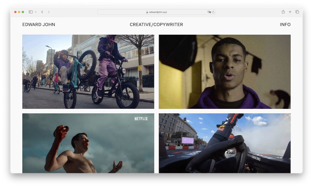
EdwardJohn.xyz is the personal website of London-based copywriter Edward John. With over five years of experience in marketing and advertising, Edward’s work spans various platforms, including TV, radio, social media, out-of-home (OOH) advertising, landing pages, emails, games, microsites, and even a public staircase. Edward’s portfolio features collaborations with major brands such as Netflix, Disney, Amazon, Red Bull, IKEA, NatWest, and Apple. Outside of his professional writing, he produces techno music and practices street photography.

Image by Edward John via EdwardJohn.xyz
Edward has organized his highlighted work in a user-friendly manner, making it simple for visitors to navigate his website. This ease of navigation can also make it easier for potential collaborators and clients to review Edward’s talents. The homepage features Edward’s projects in an easy-to-view, colorful grid layout. Check out NatWest x Team GB – Destination Tomorrow. When NatWest announced its sponsorship of Team GB for the 2024 Paris Olympics, they launched the “Destination Tomorrow” campaign to celebrate this partnership with a focus on movement, dynamism, and momentum. Building on NatWest’s “Tomorrow Begins Today” platform, the campaign aimed to inspire the nation to take action for a better future and rally support for Team GB. The multi-channel campaign included a film, radio ads, social media content, and bus wraps, all executed within four months. The campaign was recognized as Campaign‘s Ad of the Day on February 20, 2024. 1You can also check out Netflix – Ragnarok Recap. As Netflix prepared to launch the second season of Ragnarok, Edward created a compelling recap trailer to generate excitement. He designed the trailer to revisit the first season, presenting it in the style of true Nordic mythology. The final trailer was prominently featured on the Netflix home screen.
Using a FirstNameLastName.xyz domain like EdwardJohn.xyz can help make it easier for professionals like Edward to be discoverable online. A domain name that closely aligns with search terms people are likely to use — like “edward john copywriter” — can greatly improve a website’s visibility on search engines. Anyone searching for “edward john copywriter” will find EdwardJohn.xyz prominently positioned at the top of the search page (as of July 29, 2024). With a personal website using a domain name that matches your full name, it’s more likely that your website will show up in relevant results. In an age of personal branding, a tailored domain like EdwardJohn.xyz can serve as a digital business card, making it easy for clients and collaborators to connect and recognize his talents. You can learn more by following Edward on LinkedIn, X/Twitter, and Instagram, and by visiting EdwardJohn.xyz.
1.https://www.campaignlive.co.uk/article/natwest-tv-spot-team-gb-encourages-people-reach-goals/1862015
“We chose to build on .xyz because it is by far the best way for us to signal our web3-nativeness. We’re a developer-focused company, so we need to communicate that clearly. Using a .xyz domain is our way of speaking to web3 devs: we’re like you, we get you, and we understand the problems you’re facing.”
– Matt Katz, CEO, Caldera.xyz
Discover a curated selection of available .xyz domains with our .xyz premiums, .xyz numbers, and CNOX search tools.
* Premium XYZ Registry domains refer to premium domains for extensions with standard and premium domains, and XYZ’s premium namespaces such as .Cars, .Car, .Auto, .Theatre, .Storage, .Security, and .Protection.
** “BIN” (or High/Low) priced premium domain. Domains in this tier have a premium price for the first year, but renew at standard pricing. All other premium domains have annual premium renewal fees.
(not ranked)
| G.xyz | Crypto.Yachts** |
| O.xyz | Chat.CEO |
| Decibel.xyz** | 21.Game |
| Pizza.LOL | Rose.Game |
| Invisalign.Lat | MM.Audio |
| Chair.Pics | Ivy.Security |
| Logo.Monster** | Pickard.Theatre |
| Gym.Quest** | OnlineBrand.Protection |
| Bella.Baby** | Nitro.Auto |
| Compare.Boats** | BSA.Cars |
| M.xyz | 10.Game |
| Scan.xyz | HZ.Audio |
| O7.xyz** | Pulse.Security |
| Chart.LOL | App.Security |
| Cult.Quest** | Sentry.Security |
| Compare.Yachts** | Browser.Security |
| For.CEO | Omar.Auto |
| Data.Game | Ocean.Auto |
| HA.Game | Wunder.Cars |
| CivilWar.Game | Walrus.Storage |
(source: Namebio.com)
| Total dollar value: $128,414.00 |
| Average price: $1,337.65 |
| Low price: $100.00 |
| High price: $14,888.00 |
| Maximum SLD characters: 14 |
| 2L – 0 (0.00%) 3L – 15 (16.63%) 4L – 19 (19.79%) |
(Ranked by volume)
(Price listed is MSRP)
(source: Namebio.com)
(source: Internal Data***)
*** Starting March 2023, the Top 10 Trending .xyz SLD Keywords are expanded to include 2-character keywords.
Starting July 2023, we have expanded from Top 10 to Top 20 Trending .xyz SLD Keywords, and added the 2-character keyword “my” in our dataset. Though we consider “my” to be a keyword modifier, this addition is intended to align with industry focal points.
1. https://www.coindesk.com/tech/2024/07/24/calderas-rollup-in-a-box-platform-raises-15-million-from-peter-thiels-venture-fund/
2. https://www.theblock.co/post/302874/mamori-raises-5-million-in-blockchain-capital-led-seed-funding
3. https://coinlaunch.space/blog/dora-search-engine-closes-5-million-funding-round/
4. https://www.theblock.co/post/307487/brevan-howard-digital-monad-liquid-staking-protocol-kintsu-funding
5. https://www.theblock.co/post/304287/crypto-payment-kulipa-mastercard-argent-debit-card
6. https://www.theblock.co/post/304985/after-launching-telegram-clicker-game-pixelverse-raises-additional-2-million
7. https://www.prweb.com/releases/bob-completes-1-6m-strategic-raise-from-ledger-ventures-and-angel-investors-302191874.html
8. https://medium.com/@dill_xyz/dill-secures-pre-seed-founders-round-building-the-most-scalable-data-availability-f104a0b04cd5
9. https://alexablockchain.com/risklayer-secures-pre-seed-funding/
< Previous Month
Web3PlusAI.xyz – Namecheap customer- (Bulgaria)
Industry leaders, skilled creatives, and tech-focused organizations are utilizing .xyz and more XYZ Registry domains like .Security and .CEO to explore AI’s potential. Researcher Lennart Heim uses Heim.xyz to explore the complexities of AI governance. Cybersecurity platform Astrix.Security aims to keep enterprise systems secure from cyber attacks and data breaches. Media and technology mogul MikeJohns.CEO blends AI and human insight on his .CEO domain. In this week’s #AIMonday, we’ll introduce you to a platform dedicated to the intersection and synergies of blockchain and AI: Web3PlusAI.xyz.

Web3PlusAI.xyz is the online hub of Web3 + AI, a blog and newsletter platform dedicated to exploring the intersection and synergies of blockchain and AI. Founded by Albena Kostova-Nikolova, an experienced blockchain professional, this platform aims to analyze and showcase how these two transformative technologies combine and complement each other. With a mission to inform and educate, Web3 + AI delves into new ventures, research papers, and applications that unite crypto and AI, offering insights for both newcomers and experienced professionals. The content is accessible for free, with options to support the work through crypto payments, fostering a community passionate about technological progress.
Albena, the founder of Web3 + AI, launched the platform in November 2023. She also co-founded the ETHSofia Conference & Hackathon in February 2024, held in Sofia, Bulgaria, which features speakers such as Qi Zhou, a notable Ethereum ecosystem contributor and founder of EthStorage and QuarkChain Foundation. Prior to founding Web3 + AI, Albena worked as a Marketing Executive at a decentralized machine learning platform, and a P2P order book and agent-based decentralized exchange. With over five years of experience in crypto marketing and a keen interest in machine learning and deep learning, Albena focuses on the intersection of blockchain and AI.
The content on Web3PlusAI.xyz is tailored for both newcomers and experienced professionals, providing summaries of key developments to save readers time on research. Recent blog posts include “The Web3 and AI Newsletter 25,” which discusses the introduction of Oasis PrivateSQL by Oasis Labs to the Google Cloud Marketplace, a tool that uses differential privacy technology for secure data analytics, and Atoma’s partnership with the Sui blockchain to provide AI solutions for various applications. Additionally, Albena regularly posts Web3 and AI Funding Bulletins, covering the latest investments in companies merging blockchain and AI. The website also features a Web3 + AI Directory, an embedded spreadsheet showcasing various AI and blockchain platforms, including decentralized trading aggregator BubbleAI.xyz and AI integration innovation platform AgentLayer.xyz, with details such as name, category, website URL, and X/Twitter handle. All content is freely accessible, with the option to subscribe to the newsletter and support the platform through crypto payments. The website also encourages community engagement through social media, aiming to build a passionate and informed audience around these transformative technologies.
The choice of .xyz as the domain for Web3 + AI reflects the platform’s commitment to innovation and forward-thinking in the realms of blockchain and AI. The .xyz domain is known for its versatility and appeal to tech-savvy audiences, making it an ideal match for a platform dedicated to cutting-edge technologies. By opting for .xyz, Albena aligns her brand with a global community of innovators and creators who are pushing the boundaries of possibility. This domain choice also underscores the platform’s goal to democratize and decentralize information, fitting seamlessly with the mission to explore and promote the integration of blockchain and AI. The .xyz extension symbolizes a generation of internet users and companies that value creativity, diversity, and technological advancement, making it a fitting domain choice for Web3 + AI. We had the opportunity to speak with Albena about the decision to develop her platform on .xyz. As she explained,
“There is no other domain extension that personifies the spirit of freedom, innovation, and collaboration the way .xyz does. It’s no wonder that the crypto space has embraced it, since it is advocating and fighting for these same values!”
You can learn more about Albena and her online hub by following along on X/Twitter, LinkedIn, GitHub, and Instagram, and by visiting Web3PlusAI.xyz.