At XYZ Registry, addressing safety and security in our Top Level Domains (TLDs) has always been a top priority. Over the past decade, we’ve developed and refined our robust anti-abuse process that proactively monitors, detects, and addresses misuse within our ecosystem of top level domains. Whether it’s phishing, spam, or the distribution of malware, we take swift and decisive action to suspend domains that violate our Anti-Abuse Policy.
To report abuse of .xyz or any XYZ Registry TLD, please open a ticket at https://gen.xyz/abuse or email [email protected].
To provide greater insight into our ongoing efforts, we’ve made two new key resources available for our community.
First, the XYZ Registry Anti-Abuse hub on https://xyz.xyz/abuse, where you can learn more about our monitoring process, find information on how to report abuse, and understand the actions we take in collaboration with industry partners and law enforcement.
Secondly, we’re now publishing a quarterly report that highlights some of the proactive measures our team has taken to address abuse in the past quarter. Be sure to check out the Q2 2024 Anti-Abuse Quarterly Report for the latest insights.
As we continue to safeguard our domain space, these resources serve as a testament to our unwavering commitment to a safer internet. We encourage you to explore these new tools and join us in the ongoing fight against online abuse.
Ctrl.xyz – Amazon customer – (United States)
Forward-thinking web3 businesses are embracing .xyz domains and upgrading to domain names that signal expansion. NFT platform Evaluate.xyz is aimed at making NFT collecting safe, social, and enjoyable. Fintech company Party Round rebranded to Capital.xyz with a goal of continuing to help startups raise money with new, additional features. Web3 company TAIKAI Labs rebranded to LayerX.xyz with a focus on connecting web3 developers and organizations to create innovative solutions. In this week’s #BlockchainThursday, we’ll introduce you to a newly rebranded crypto wallet designed to enhance user experience and accessibility in the blockchain space: Ctrl.xyz
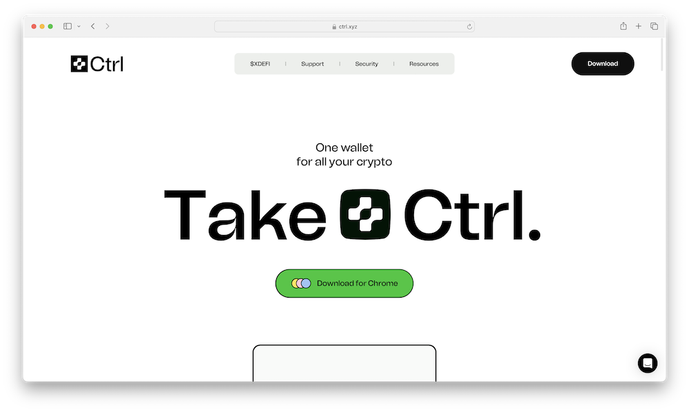
Ctrl.xyz is the online home of the newly named non-custodial crypto wallet Ctrl (previously XDEFI), designed to enhance user experience and accessibility in the decentralized finance (DeFi) and blockchain space. Pronounced “Control”, the platform aims to simplify user onboarding and usability by removing gas fees on every chain, supporting multiple networks, and integrating social login options such as Google and social media accounts. As a non-custodial wallet, Ctrl claims users have full control over their private keys and assets, without relying on third-party custody. Ctrl aims to help users manage digital assets and interact with decentralized applications (dApps) without the complexity of traditional seed phrases, promoting broader adoption of web3 technologies.
The platform emphasizes security and user control, aiming to ensure that users have full sovereignty over their financial assets. It does not have access to users’ secret phrases, passwords, or recovery codes, placing the responsibility of safeguarding this information entirely on the user. By eliminating the need for complex seed phrases through social login options and simplifying wallet management, Ctrl focuses on robust security standards while making the user experience more accessible and intuitive.
Ctrl.xyz claims the platform offers extensive support for over 1,800 blockchains, making it one of the most versatile wallets available. It aims to help users manage millions of assets and NFTs from various blockchain ecosystems, including Ethereum, Bitcoin, Solana, Cosmos chains, THORChain, and TRON. The wallet’s NFT gallery showcases NFTs from more than 30 chains, providing a platform for users to view and manage their digital collectibles. Additionally, Ctrl is designed to connect seamlessly to decentralized applications (dApps) across all supported blockchains and testnets, allowing users to access and interact with a wide range of applications from a single interface.
The .xyz domain is an ideal choice for the newly named Ctrl platform due to its universal appeal and association with innovation and modernity. The simplicity and uniqueness of the .xyz domain can enhance brand identity, helping to ensure that users can easily remember and access Ctrl. Additionally, .xyz has gained popularity among tech companies, startups, and web3 projects, positioning Ctrl within a community of innovative and tech-savvy businesses. Ctrl.xyz is in beta as of July 2024. Interested users can select the Download Call to Action (CTA) and visit the mobile app section. You can learn more by following the platform on X/Twitter, joining the Discord, and visiting Ctrl.xyz.
MarissaNg.xyz – Gen.xyz customer – (United States)
The .xyz community is home to many skilled creatives sharing their talents and passions on .xyz domains. Audio-visual artist ReneRivas.xyz showcases his post production work for brands like Suzuki and MasterCard. Copywriter MichaelShea.xyz uses his .xyz to showcase work for brands such as Little Caesars and Smirnoff. Multimedia designer, illustrator, and animator ChrisMaher.xyz highlights his array of creative projects. In this week’s #WebsiteWednesday, we’ll introduce you to a skilled pianist, dancer, photographer, and conservationist who shares her passions using a “FirstNameLastName.xyz” domain: MarissaNg.xyz.
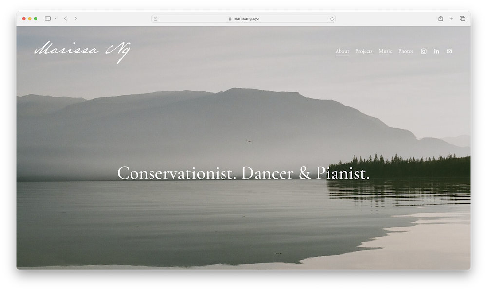
MarissaNg.xyz is the personal website of Marissa Ng, an interdisciplinary conservationist dedicated to the protection and restoration of coastal marine ecosystems. With a focus on nature-based solutions and innovative models that integrate Indigenous and Western scientific approaches, she aims to reconcile conservation efforts with economic development and social justice. Marissa works at Ocean Wise, where she collaborates with partnering First Nations on the regeneration of underwater kelp forests in the Pacific Northwest. She holds a dual-degree MBA and a Master of Science in Biodiversity, Conservation, and Management from the University of Oxford, achieved as an Oxford Pershing Square Scholar. Her professional background includes working on forest conservation models in East Africa and developing decarbonization strategies and gender equality research as a management consultant at McKinsey & Company.
In addition to her work in conservation, Marissa is a versatile artist. She is a swing dancer and classically-trained pianist with a background in competitive figure skating and ballet. Marissa’s creative pursuits extend to photography, capturing moments from her extensive travels and adventures across various continents. Her artistic talents complement her passion for environmental exploration and advocacy.

Marissa Ng
Marissa’s website design facilitates easy exploration of her various projects, music samples, and photography. Visitors can navigate through these categories by making a selection from the menu in the top right corner. This user-friendly design enhances the experience of exploring Marissa’s portfolio. Her showcased projects include Ocean Wise: Seaforestation (2022-2023), which involved a kelp regeneration initiative in collaboration with Metlakatla Development Corporation and Ecotrust Canada in Ts’msyen Territory near Prince Rupert, British Columbia. The project aimed to restore kelp forests and enhance the relationship between humans and these vital marine ecosystems. In March 2023, the project helped restore approximately 1.6 hectares of Bull Kelp to its natural habitat. 1You can also check out Marissa’s music page, which features embedded samples of her piano compositions. Marissa shares that she began playing piano at a very young age and completed The Royal Conservatory of Music Level 9 (practical and theory) at age 13. She has performed at numerous recitals around the world and has been hired to play at the University of British Columbia Alumni Centre. Marissa is interested in blending improvised piano melodies with ambient sounds of the sea. One sample, “Dream of Flying,” is a cover of a song by renowned composer Brian Crain, originally released in 1998. The photos page on Marissa’s website features a collection of images capturing her travels and experiences in various locations. The photos include landscapes, candid moments, and scenes from her adventures around the world, reflecting her love for exploration and the environment.
Using a FirstNameLastName.xyz domain like MarissaNg.xyz can help make it easier for Marissa and her passions to be discoverable online. Anyone who Googles “marissa ng” will see MarissaNg.xyz at the top of the search results page (as of July 22, 2024). With a professional website using a domain name that matches your full name, it’s more likely that your website will show up in relevant results. You can learn more about Marissa by following her on LinkedIn and Instagram, and by visiting MarissaNg.xyz.
1.https://ocean.org/blog/piloting-kelp-regeneration-with-metlakatla-development-corporation-and-ecotrust-canada-field-notes-from-tsmsyen-territory-prince-rupert/Mamori.xyz – Namecheap customer – (China)
Innovative developers are using .xyz domains to leverage AI and optimize their solutions. AI enhancement platform FractionAI.xyz explores the potential of human feedback. AI-enhanced software platform Covalent.xyz aims to ensure that complex workflows are executed with ease. AI-enhanced educational platform Learn.xyz is designed to make learning fun. In this week’s #AIMonday, we’ll introduce you to a startup aimed at enhancing security in the web3 ecosystem: Mamori.xyz.
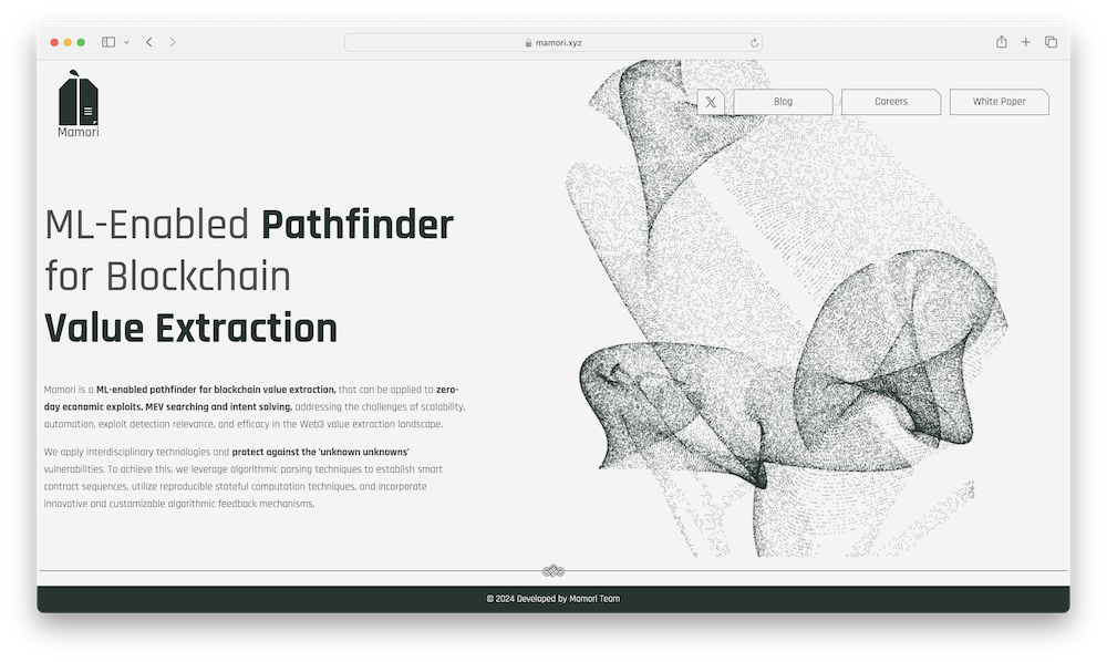
Mamori.xyz is the online home of Mamori, a startup that uses machine learning to improve blockchain security. Machine learning, a subset of AI, involves the use of algorithms and statistical models to enable computers to perform tasks without explicit instructions, relying instead on patterns and inference. Mamori aims to find and fix vulnerabilities in the web3 ecosystem using advanced testing techniques and a mix of cutting-edge technologies. This approach helps address new, unexpected economic attacks and maximize extractable value (MEV). Mamori provides a solution designed to identify both technical and economic risks, thereby improving blockchain security. In July 2024, Mamori raised $5 million in seed funding, led by Blockchain Capital, with participation from Velocity.Capital and Web3.com.1
Mamori’s technology addresses significant challenges in the web3 space, where cyber-attacks resulted in over $2.4 billion in losses in 2023. 2Mamori says that traditional auditing tools, which are based on historical data, often fall short in effectively securing this specific type of technology. 3 4Mamori uses machine learning and advanced fuzzing techniques to proactively identify and mitigate vulnerabilities. Fuzzing is a software testing technique that involves inputting random or unexpected data into a program to discover security vulnerabilities and bugs. The startup aims to create a safer and more efficient blockchain ecosystem by combining smart contract auditing with value extraction capabilities.
As highlighted on their blog, Mamori’s approach leverages interdisciplinary knowledge from web2, such as optimization algorithms and fuzzing logic, to enhance security in the web3 space. Their automated smart contract auditing tool uses an algorithmic parser to identify important functions and solve optimization problems to find the best sequences and parameters. Mamori’s algorithm is designed to find new ways to exploit vulnerabilities using swarm intelligence. Swarm intelligence, inspired by the behavior of social insects like ants, bees, and birds, involves simple agents working together to solve complex problems. Each agent follows simple rules and interacts with others, leading to the emergence of intelligent behavior as a group. This natural process of cooperation and coordination is mimicked in computer algorithms to solve difficult problems. Although it currently focuses on EVM-compatible chains, Mamori intends to expand to other virtual machines and develop a decentralized network to improve its value extraction capabilities.
Mamori’s choice of .xyz reflects the startup’s focus on innovation and technology. The .xyz extension is known for its appeal to cutting-edge companies and tech-savvy audiences, making it a fitting choice for Mamori, which operates at the intersection of blockchain and machine learning. A domain name like Mamori.xyz aligns with Mamori’s mission to revolutionize web3 security and also underscores its commitment to leveraging advanced technologies to tackle complex challenges in the blockchain space. You can learn more about the company by following them on X/Twitter @mamori_xyz and by visiting Mamori.xyz.
1.https://www.theblock.co/post/302874/mamori-raises-5-million-in-blockchain-capital-led-seed-funding 2.https://sg.finance.yahoo.com/news/mamori-xyz-raises-us-5-071500100.html 3.https://sg.finance.yahoo.com/news/mamori-xyz-raises-us-5-071500100.html 4.https://mamori.xyz/blog/introducing-mamori-the-ml-enabled-automated-value-extraction-system-for-exploits-mev-searching-and-intent-solvingCymbal.xyz – GoDaddy customer – (United States)
The .xyz community consists of various web3 platforms that share the common goal of empowering users. Web3 platform Bonfire.xyz wants to revolutionize creator engagement and digital ownership. Crypto index-focused startup Alongside.xyz aims to make it easier for investors to gain exposure to the entire crypto asset market. NFT platform Highlight.xyz strives to simplify technical barriers for creators. In this week’s #BlockchainThursday, we’ll introduce you to a web3 platform that aims to make blockchain data easier to understand by all: Cymbal.xyz.
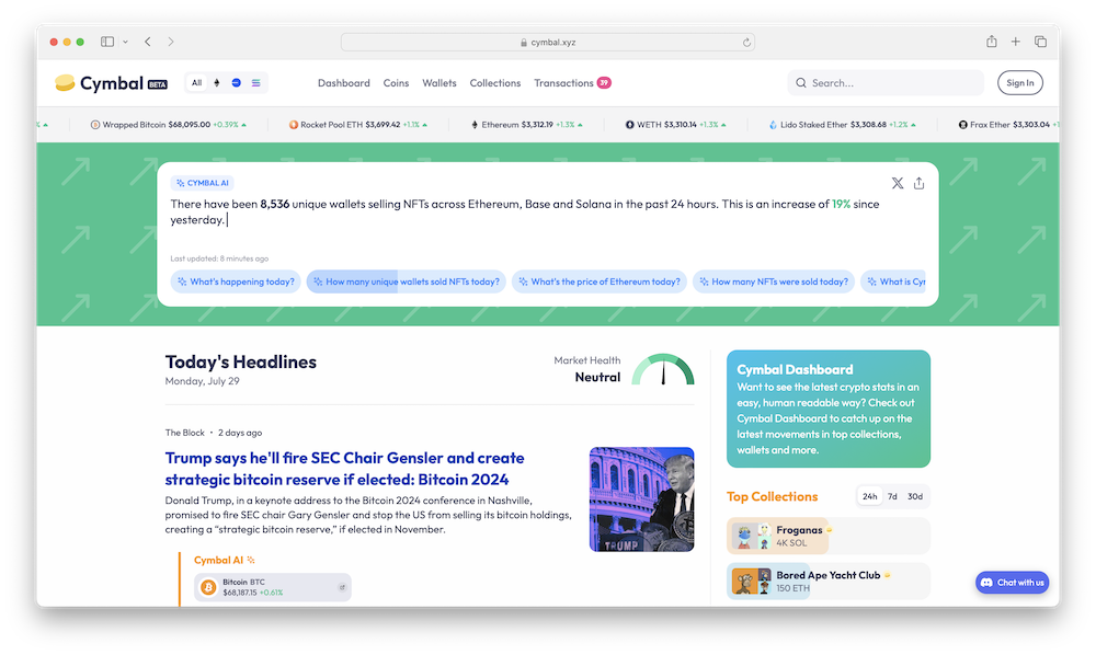
Cymbal.xyz is the online home of Cymbal, a blockchain explorer designed to make Ethereum data accessible and understandable to the average user. Launched in beta in 2023, Cymbal offers a visual and social interface designed to transform complex blockchain data into an easily digestible format. Initially focusing on NFTs, Cymbal plans to expand its data coverage to include broader cryptocurrency and token transactions and support additional blockchains like Solana and Polygon. Cymbal aims to democratize blockchain data and attract a wider audience to the crypto ecosystem. In July 2023, Cymbal raised $18.5M in funding, with support from First Round Capital, Solana Ventures, CAA Connect, Coinbase Ventures, and more.1
The platform provides a graphical user interface that incorporates NFT artwork, data trends, public information on wallet owners, and relevant news. It also utilizes AI to generate conversational summaries of transactions and trends. Cymbal incorporates social features to help users follow wallets and projects, personalize their profiles, and interact within the platform, similar to a social network. Future enhancements like messaging and content publishing are geared towards enhanced user engagement. 2The platform’s mission is to provide an accessible entry point to web3, empowering users to navigate the blockchain landscape with ease and confidence.
Cymbal news, labeled “Today’s Headlines” on the homepage, is a feature designed to aggregate and rank articles about blockchain topics, ranging from Solana transaction volumes to new airdrops, token launches, and NFTs. Drawing on the talents of a team with experience in building news products at Flipboard and collaborations with news organizations like Decrypt, Today’s Headlines curates content from leading web3 sources such as CoinDesk, The Block, and more. Using Cymbal AI, the platform enhances these articles with real-time data, providing interactive charts, stats, summaries, and proprietary insights. 3This helps users stay current on web3 developments and gain a deeper understanding of the news.
CEO and co-founder Eric Feng has extensive experience in the tech industry, spanning roles in major companies and significant contributions to various startups. He is also the co-founder of Gold House Ventures, an organization supporting Asian and Pacific Islander founders. Previously, he worked at Meta through the acquisition of the video commerce startup Packagd, served as a General Partner at the venture capital firm Kleiner Perkins, and held the position of CTO at popular streaming platform Hulu.
Choosing the .xyz domain for its website was a strategic move for Cymbal, aligning with its mission to make blockchain data more accessible and user-friendly. .XYZ is recognized for its versatility and modern appeal, resonating well with innovative and forward-thinking projects like Cymbal. As a domain extension that transcends traditional boundaries, .xyz reflects Cymbal’s goal to democratize blockchain technology and attract a broader audience. Additionally, the .xyz domain is popular among tech-savvy users and startups, positioning Cymbal within a dynamic community of innovators. This choice underscores Cymbal’s commitment to being at the forefront of the web3 revolution, offering a memorable and relevant online presence that complements its innovative platform. You can learn more about Cymbal by following along on X/Twitter @cymbalxyz and LinkedIn @cymbalxyz, and by visiting Cymbal.xyz.
1.https://www.crunchbase.com/organization/cymbal-6bef 2.https://decrypt.co/149202/cymbal-human-readable-ethereum-blockchain-explorer-etherscan 3.https://efeng.medium.com/introducing-cymbal-the-human-readable-block-explorer-97f719742413